Final Report
Motivation
The World Happiness Report is a landmark survey of the state of global happiness. In a generalized view, the progress of the nations seems to somewhat affect the measurements of well-being, or the happiness of the citizens. Therefore, the happiness indicator may serve as a guide for the governments, organizations, and civil societies to assess their policy-making decisions. The World Happiness Report reviews the state of happiness in most of the countries across the years along with other possible factors that would explain the variations in happiness scores across countries and regions.
We are motivated to explore the possible relationship between the variations in happiness and other possible factors such as geographical region, GDP per capita, social support, freedom to make life choices, healthy life expectancy, generosity, and perceptions of corruption.
How might these or some of these factors affect the state of happiness in general? Based on different regions, are the differences in each variable significant? What if taking the pandemic of Covid-19 into account? We are interested to find out the answers to these questions and draw conclusions on the importance of the factors that a nation would focus on. An interactive shiny app is also included for a better understanding of the variables and associations.
Research questions
What is the ranking of the mean Life Ladder Score based on different regions?
What are the trends of the distribution of each variable across the years 2005 to 2021, based on different regions?
Are the mean Life Ladder Scores significantly different based on regions?
Whether the mean Life Ladder Score of each region significantly differs before and after the pandemic? If yes, whether the score before is greater than the score after the pandemic?
Are the variables significantly different between “happy regions” and “unhappy regions”?
Whether the distributions of the Life Ladder Score differ between “happy regions” and “unhappy regions”?
What are the possible variables that could be used to predict the Life Ladder Score in 2021?
How much does GDP associate with the Life Ladder Score?
Does any variable interact with GDP in the model and whether it is significant?
Data
We used multiple data sets for our project. For our main research questions, we used the data from World Happiness Report from 2005-2021, which uses global survey data to report how people evaluate their own lives in more than 150 countries worldwide. For exploration analysis we used all data from 2005 to 2021, and for regression analysis and principle component analysis we focused on report in 2021.
Variables of interest:
country_name
regional_indicator: region that the country belongs to
ladder_score: happiness index from 1 to 10 measured by the national average response for Gallup World Poll (GWP)
logged_gdp_per_capita: the country’s economic output per person from World Development Indicators (WDI)
social_support: the amount of assistance available from other people measured by the national average response for GWP; ranges from 0 to 1
healthy_life_expectancy: healthy life expectancies at birth based on data from the World Health Organization (WHO)
freedom_to_make_life_choices: the amount of freedom to choose what to do with one’s life measured by the national average response for GWP, ranges from 0 to 1
generosity: the willingness to make donation to charities; measured by the national average response for GWP
perceptions_of_corruption: the level of corruption in the government and within business, measured by the national average response for GWP; ranges from 0 to 1
Methods
Data processing and cleaning
World Happiness Report pre 2021 (dataset)
The World Happiness Report pre 2021 contains 11 variables, describing each country’s happiness score (Life Ladder Score) and its social, economic, public health and other information that reflect the progress of the nation.World Happiness Report 2021 (dataset)
The World Happiness Report 2021 contains 20 variables, describing each country’s happiness score and information that reflect the progress of the nation, along with some calculated statistics.Combined World Happiness Report (dataset)
The 11 variables in World Happiness Report pre 2021 are reduced to 9 to match the variables from the World Happiness Report 2021. The 20 variables in World Happiness Report 2021 are reduced to 10 with an additional regional_indicator. We merged the two datasets by first nesting the variables other thancountry_namesin pre 2021 and variables other thancountry_namesandregional_indicatorin 2021 and then usingleft_join(). We combined the nested variables from two datasets withmap2()andbind_rows(). Finally, unnested the variables and dropped na’s. The resulting dataset was exported.
Exploratory analysis
For our exploratory analysis, we wanted to first analyze the main characteristics of each variable to examine the reliability of our later tests and regression. We found out that out of the total 1816 observations, only 49 observations belong to East Asia, and only 1 observation is from 2005. Furthermore, there are six countries (China, Hong Kong, Kosovo, Maldives, North Cyprus, Turkmenistan) that only have one observation. Therefore, the statistical tests and regression results might not apply for these countries/regions/years.
Looking at the distribution of each continuous variable, ladder score, logged gdp per capita, generosity are all symmetrically distributed, with mean at 5.47, 9.35, and -0.003 respectively. Social support, healthy life expectancy, freedom to make life choices, and perceptions of corruption are all skewed right, with median at 0.84, 65.3, 0.77, and 0.80 respectively. The skewness may suggest some transformation, for instance log transformation. Summary tables are also made to show the descriptive statistics of each variable. The first table combined all the observations and calculated the mean and standard deviation for each variable. The second table is separated by regional indicator, and the third table is separated by year.
In order to discover trends and patterns in our dataset, we also created several visualizations of the variables. To investigate life ladder score, we first plotted a bar plot that represents the mean life ladder score from 2005 to 2021 for different regions. From the plot, we found that North America and ANZ has the highest mean life ladder score, while Sub-Saharan Africa has the lowest. Additionally, we plotted box plots to show the distribution of ladder score for each region from 2006 to 2021. Note that 2005 was excluded from the plot because it only has one observation. The box plots show relatively stable distributions of life ladder score for North American and ANZ and Western Europe across years. Interestingly they are also the two regions with the highest mean life ladder score. We also plotted the mean life ladder score for the top 50 countries. These countries have mean life ladder scores ranging from around 6 to 7.5. Western Europe has the highest proportion among the top 50 countries.
Box plots were also made to show the distribution of all other variables for different regions across years. North American and ANZ and Western Europe are the two regions with highest logged GDP per capita, social support, healthy life expectancy, and freedom to make life choices, which suggest that these variables may have positive correlation with life ladder score. North American and ANZ and Western Europe are also the two regions with lowest perception of corruption, suggesting that it might be inversely correlated with life ladder score. Overall, logged GDP per capita and healthy life expectancy indicate increasing trends across years for all regions.
Lastly, we made interactive maps to show the mean value of each variable across years for each country, where a darker color indicates higher value. For life ladder score, Canada, Australia, and Western European countries have noticeably high values. This trend is found similarly for logged GDP per capita, social support, healthy life expectancy, and freedom to make life choices. The opposite trend is found for perceptions of corruption (i.e. Canada, Australia, and Western European countries have noticeably low value for perceptions of corruption). These findings align with the findings from box plots and suggest that these variables might be strongly correlated with life ladder score.
Statistical tests
Statistical Tests are conducted to discover the differences of the ladder score between each region, the impact that Covid-19 might have on the ladder score, and the differences of ladder score and each variable in regions that have relatively high ladder scores and regions that have relatively low ladder scores.
To investigate the variabilities of the ladder scores between different regions, we conduct an anova test for the population mean of the ladder scores in each region. We compute an One-way ANOVA test to determine whether the mean population ladder score is the same for all the eight regions in our data. To conduct the test, we nested the data based on region, and computed the sample mean of the ladder score for each region. The hypothesis for the test are:
\(H_0\): The population mean of the ladder score is the same for all the 10 regions.
\(H_a\): At least one population mean of the ladder score is different.
## Call:
##    aov(formula = ladder_score ~ factor(regional_indicator), data = happy_meta)
##
## Terms:
##                 factor(regional_indicator) Residuals
## Sum of Squares                    1446.984   860.851
## Deg. of Freedom                          9      1806
##
## Residual standard error: 0.6904069
## Estimated effects may be unbalanced
In this test, we get a p-value that is very close to zero, which indicates that the ladder score is the same for all the countries. Thus, we can conclude that at least one population mean ladder score of the 10 regions are different. This result agrees with our visualization of the estimates and the confidence intervals of the ladder score in the 10 regions.
Moreover, we are interested in whether the population mean of ladder score changes due to the Covid-19 pandemic. We divided the data into 2 groups: “before covid” and “after covid” based on what year the data is in. If the observation is before 2019, we classify it in the “before covid” group, and if the observation is after or in 2019, we classify it in the “after covid” group. Than we compute a two sample t-test with equal variances after checking the variances of these two groups. In this case, we unexpectedly found out that the mean population ladder score during covid is actually higher than the mean population ladder score before covid. The hypothesis for this test are:
\(H_0\): the population mean of ladder score is the same for the time period before covid-19 and the time period after covid-19 for all countries.
\(H_a\): the population mean of ladder score is the smaller for the time period before covid-19 and the time period after covid-19 for all countries.
| estimate | estimate1 | estimate2 | statistic | p.value | parameter | conf.low | conf.high | method | alternative |
|---|---|---|---|---|---|---|---|---|---|
| -0.186 | 5.434 | 5.62 | -2.797 | 0.003 | 1814 | -Inf | -0.077 | Two Sample t-test | less |
The p value in this case is very small, thus we have strong evidence to say that the population mean of the ladder score after covid-19 is higher than the happiness score before covid-19. This might be due to the work from home working mode allowing people to spend more time with people they loved, development of technology and life quality with time that is not related to covid, or any other factors. However, the sample size of the after covid data is much smaller than the sample size of before covid data, this may also cause bias in our analysis. We then stratified our analysis on the 10 regions: for each region, whether covid causes change in the population mean of the ladder score, the results found out that for region: Central and Eastern Europe, Commonwealth of Independent States, and Sub-Saharan Africa, the population mean ladder score increased after covid, while for the region North America and ANZ the population mean ladder score decreased after covid.
We are also interested in Whether the regions that have high happiness scores throughout 2008-2021 differ in properties than the countries that have relatively low happiness scores throughout 2008-2022. We divide all the 10 regions into two groups “happy regions” and “unhappy regions” based on previous analysis on the estimates and the confidence intervals of the ladder scores. We are going to conduct two sample t-tests on the happy region group and the unhappy region group on each variable, and find out whether those regions have differences in logged gdp per capita, social support, healthy life expectancy, freedom to make life choices, and perceptions of corruption. For each variable the hypothesis are:
\(H_0\): the population mean of the variable value is the same for the happy regions and the unhappy regions.
\(H_a\): the population mean of the variable value is different, greater or less for the happy regions than the unhappy regions.
After conducting five two sample t tests, we find out that for all the tests except for the generosity value, the p-value is lower than 0.005, so we conclude that our 2 sample t tests show strong evidences that the factors include in the data differ a lot for happy regions and unhappy regions, except for the generosity index.
Finally, we want to see whether the distribution of the ladder score is different in the happy regions and the unhappy regions by conducting a permutation test. In the permutation test, we assign a label (“0” or “1” to the observation belonging to the happy regions and the observation belonging to the unhappy regions). The label itself is independent of the ladder score we are testing on, and we shuffle the labels to replicate our process of getting the test statistic. For simplicity, we choose our test statistic to be the difference of the ladder score of happy regions and unhappy regions. We shuffle the label of our observation data, compute the test statistic over 1000 times and look at their distributions. In this case, our hypothesis are:
\(H_0\): the distribution of the ladder score is the same for the happy regions and the unhappy regions.
\(H_a\): the distribution of the ladder score for the happy region is different from the distribution of the ladder score in the unhappy regions.
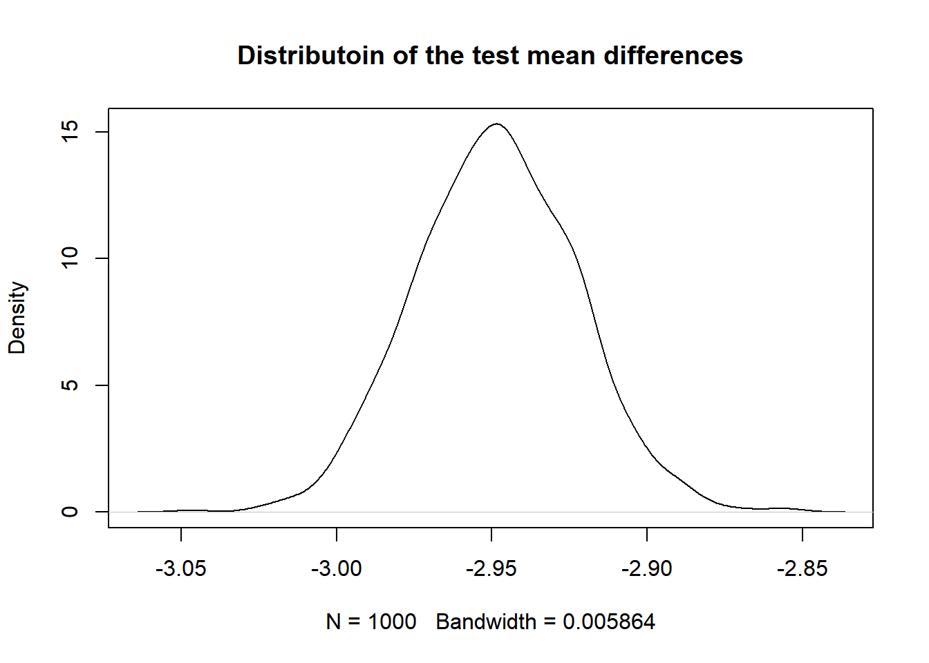
From the plot, we see that the most observed mean difference of ladder score between the happy and unhappy region is about -2.95. To compute the p value, we compute the probability that we observe a value on the mean difference distribution that is more extreme (smaller or bigger) than the observed mean differences (-2.24) in the mean difference of ladder score between the happy regions and the unhappy regions, and we get a p value of zero. This indicates that the distribution of the ladder score is different for the happy regions and the unhappy regions.
Regression analysis
After exploring and understanding the data using EDA and statistical tests, we moved to hypothesize and understand what factors in our data might have potential influence on the happy score. Here we mainly focus on the data collected from 2021 and we also transformed the original happiness score into rank to have a better understanding on the difference of happiness score among countries.
We firstly developed a full model that includes all the predictors and a model with only the intercept as baselines. Then we chose to use North America and ANZ as a reference group for comparison, and used stepwise regression procedure to find the model with the minimum Akaike Information Criteria(AIC), which is an estimator of prediction error and thereby relative quality of statistical models for a given set of data. In estimating the amount of information lost by a model, AIC deals with the trade-off between the goodness of fit of the model and the simplicity of the model. In other words, AIC deals with both the risk of overfitting and the risk of underfitting. As a result, we picked the model with the lowest AIC, which includes Region, GDP, Social.support, Freedom and Corruption. After plotting the residuals of the model, we tried to find if there should be interaction terms.
According to graphs about the relationships between predictors, It seemed like GDP and Freedom might have some interaction. We added the interaction term and it turned out that the slope of Freedom changes for every one increase in GDP, and as GDP increases, the slope of freedom decreases.
Looking at the p-value, the value of both GDP and Freedom indicate they’re insignificant(p-value > 0.05) after we added the interaction term, but the interaction effect is significant now. At the same time, the p-value for Corruption indicates it’s insignificant in our new model. We also remade the distribution plots about the residuals.
PCA/PCR analysis
Instead of using linear regression on the model, we want to see whether other models can help us predict the happiness score. In this case, we adapt principal component analysis to see the similarities between observations and correlation between predictors, and utilize principal component regression to predict the ladder score at 2021. We will also compare our pcr model with our regression model to see which one performs the best.
In the PCA analysis process, we also randomly select 75% of the dataset as our training set, and the rest 25% of the dataset as our testing set. Here we are scaling all the variables (logged gdp per capita, social support, healthy life expectancy, freedom to make life choices, and perceptions of corruption) since they have different units in this scenario. The result of PCA analysis is shown below, the linear combination of each component can also be referred from the table below.
## Importance of components:
##                           PC1    PC2    PC3     PC4     PC5     PC6
## Standard deviation     1.8067 1.1347 0.7811 0.70345 0.48008 0.33580
## Proportion of Variance 0.5441 0.2146 0.1017 0.08247 0.03841 0.01879
## Cumulative Proportion  0.5441 0.7586 0.8603 0.94279 0.98121 1.00000
We see that the first component explains about 54.4% of the variances in the data, the second component explains about 21.5% of the variances in the data, and the third explains about 10.17%. The three components will cumulatively explain about 86.03% of the variances in the data, which is relatively sufficient in this case. The results below show the results of each component and the biplot of the analysis.
##                                      PC1        PC2         PC3         PC4
## logged_gdp_per_capita         0.50557942 -0.1963624  0.03593761 -0.29956544
## social_support                0.48591366 -0.1257005 -0.33392130 -0.09087997
## healthy_life_expectancy       0.50017876 -0.1503781  0.02985716 -0.29725350
## freedom_to_make_life_choices  0.40245817  0.2799679 -0.31503571  0.77439435
## generosity                   -0.03310161  0.7821098 -0.41124119 -0.45908163
## perceptions_of_corruption    -0.30826981 -0.4826488 -0.78609591 -0.05656135
##                                      PC5         PC6
## logged_gdp_per_capita         0.11097337 -0.77619921
## social_support               -0.74850206  0.26090102
## healthy_life_expectancy       0.56834485  0.56119575
## freedom_to_make_life_choices  0.22964237 -0.08930672
## generosity                    0.06841811 -0.05149951
## perceptions_of_corruption     0.21678801 -0.06226456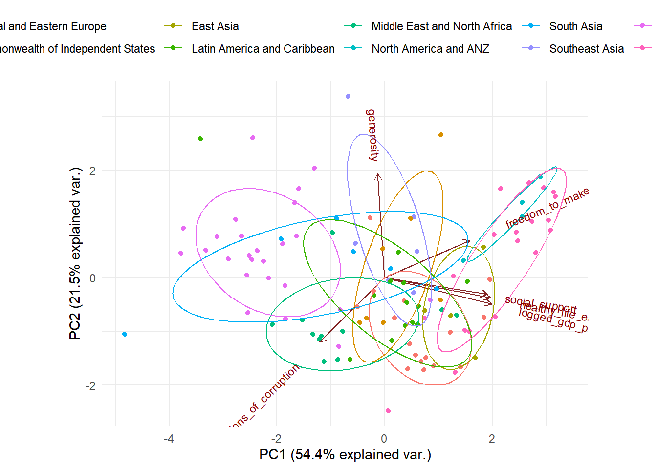
The data points closer to each other in the above biplot have a similar data pattern. When we group all the observations on the plot based on regions, we see the observations from the same region are relatively closer to each other, which means that they are similar in the pattern of the predictors. Furthermore, we can see that the predictors social support, healthy life expectancy, and logged gdp per capita are highly positively correlated with each other (shown on the plot, their vectors form very small angles with each other). The predictor freedom to make life choices is also relatively correlated with social support, healthy life expectation and logged gdp per capita. This might be a concern when we further refine our regression model.
We also implemented a PCR regression model to predict the ladder score in 2021. From the output below, we see that cross validation error RMSEP is lowest when we include 1 component in our data.
## Data:    X dimension: 111 6
##  Y dimension: 111 1
## Fit method: svdpc
## Number of components considered: 6
##
## VALIDATION: RMSEP
## Cross-validated using 10 random segments.
##        (Intercept)  1 comps  2 comps  3 comps  4 comps  5 comps  6 comps
## CV           1.095   0.4844   0.4880   0.4938   0.4972   0.5008   0.4971
## adjCV        1.095   0.4838   0.4872   0.4927   0.4959   0.4994   0.4953
##
## TRAINING: % variance explained
##               1 comps  2 comps  3 comps  4 comps  5 comps  6 comps
## X               54.40    75.86    86.03    94.28    98.12   100.00
## ladder_score    80.68    80.85    80.97    81.03    81.06    81.68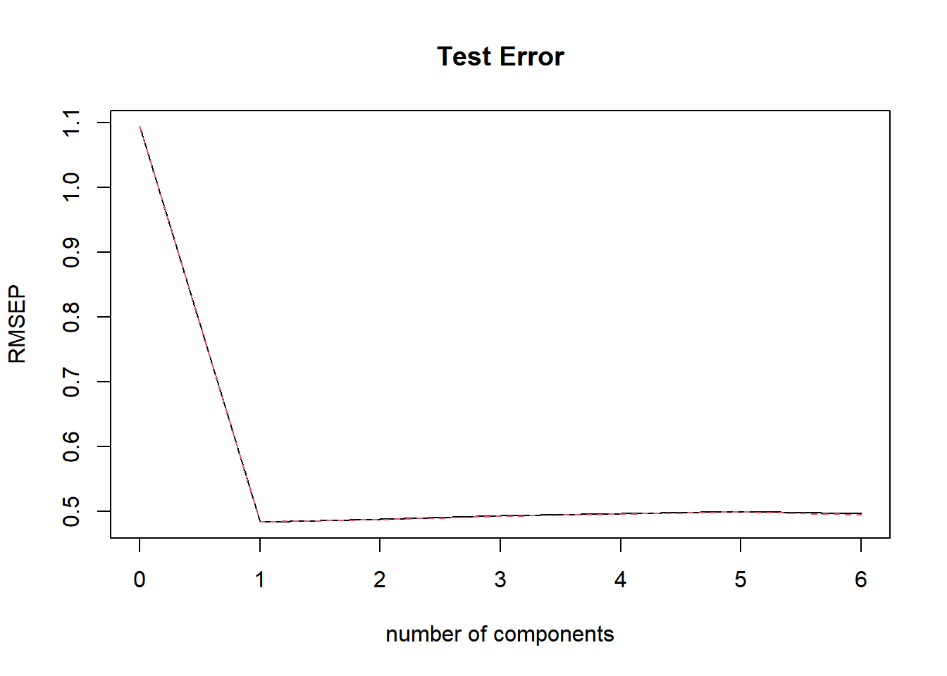
When we look at the cv results and plot, we also see that when we add one principal component, the test error will be the lowest. As a result, we use one principle component in the PCR model to make predictions on the out of sample observations. We compute the test mse for the PCR model by taking the prediction of the PCR model on the test set’s ladder score, subtract the observed values of the ladder score and taking the mean square of them, then repeat the same process for the training data. We get a test MSE value of 0.47, and a train mse of 0.227. What’s more, we want to compare the performance of the PCR regression to the best regression model we’ve obtained in the regression analysis. In this case the test MSE value of the selected best regression model is around 0.38, and the train MSE value of the regression model is 0.18. Thus, in this case, the regression model outperforms the PRC model.
Discussion
Findings and summary
To answer our research questions:
The ranking of the mean life ladder score from lowest to highest region is Sub Saharan Africa, South Asia, Commonwealth of Independent States, Middle East and North Africa, Southeast Asia, Central and Eastern Europe, East Asia, Latin America and Caribbean, Western Europe, North America and ANZ.
From the One Way ANOVA test, we found that at least one region has a mean ladder score different from others.
By conducting two sample t-tests, we found that in Central and Eastern Europe, Commonwealth of Independent States and Sub-Saharan Africa, mean ladder scores increased after covid. In North America and ANZ, mean ladder score decreased after covid. In all other regions, mean ladder scores stayed the same before and after covid.
Comparing regions with relatively high ladder scores (“happy regions”) with regions with low ladder scores (“unhappy regions”), we conclude that “happy regions” have higher logged GDP per capita, social support, healthy life expectancy, freedom to make life choices. “Happy regions” also have different perceptions of corruption than “unhappy regions”, though the mean generosity is the same between the two types of regions.
Permutation test suggests that the distribution of ladder scores for “happy regions” and “unhappy regions” are different.
Regional indicators, logged GDP per capita, social support, and freedom to make life choices have strong relationships with and can be used to predict life ladder scores. Although GDP is a strong predictor for ladder score, there is strong interaction between GDP and freedom to make life choices, meaning that the effect of GDP on ladder score depends on the value of freedom to make life choices.
According to regression analysis, the correlations between GDP and Ladder Score seemed to be very strong, and the initial regression model(including Region, GDP, Social.support, Freedom and Corruption as predictor) would suggest that GDP is a powerful predictor of the Happiness Ladder Score, but after adapting interaction term and refit model, we found that the relationship between Freedom and GDP couldn’t be ignored: these two seemed to influence each other and we couldn’t eliminate either of them.
The PCA analysis shows that observations from the same region show a similar pattern in predictors, and there is a strong positive correlation in social support, healthy life expectancy, and logged gdp per capita.
Comparing the PCR and the regression models based on MSE, we conclude that the regression model is the best model.
Limitations
The dataset has very few observations for China, Hong Kong, Kosovo, Maldives, North Cyprus, Turkmenistan and for 2005, which prevented us from gaining meaningful insights about the life ladder score for these countries and year. There are also a few countries in Africa that have no observation at all, finding data about their happiness index could give us a more comprehensive image for our project. Furthermore, aside from the variables investigated in this project, there are many other factors that can influence happiness, such as schooling, health care, quality of medical treatment, etc. Including these extra variables in our model can possibly improve our prediction about life ladder score.
Next steps
If we are able to find datasets related to COVID-19 on the variables we used, we could explore how the pandemic affected these variables such as GDP, healthy life expectancy, social support, freedom to make life choices, and generosity as well as how they work together to have influence on the state of happiness. Since the pandemic might serve as a confounder or have interactions with other variables, we think that by including the data related to COVID-19, a better model could be built to predict future Life Ladder Score. We also believe that by addressing the possible effects of COVID-19 on global happiness and other variables, the government and organizations would be able to make better decisions.